We’re proud to launch our visual upgrade to the Adelphi website. This makeover brings our website into alignment with our new brand standards.
 |
 |
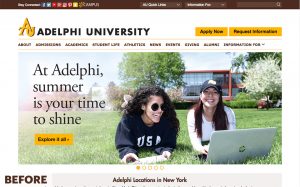
Today, we’re proud to launch our visual upgrade to the Adelphi website. This makeover brings our website into alignment with our new brand standards and logo.
With this change, you’ll notice a more modern feel and a clean appearance.
- The color scheme now emphasizes Adelphi’s gold with brown, black, white and gray as highlight colors.
- Site fonts have been updated to align with the new brand fonts.
- The University’s social media buttons are now located in the site footer instead of the header.
- The eCampus button will remain in header but with a different look; it will now also be easy to find in mobile view.
- Banner headlines on the homepage will be shorter and optimized for viewing on mobile devices.
- News and events feeds are a new feature of the Adelphi homepage, giving you an at-a-glance view of what’s happening at Adelphi.
- The website navigation is largely unchanged. The structure of each of Adelphi’s sites is mostly intact, with minor changes to top navigation.
As we look ahead, our web team’s long-term project is the top-to-bottom redesign of our website, which is expected to debut next year. The full redesign will implement user-focused navigation and content, and will incorporate new features.
For further information, please contact:
Office of University Communications and Marketing
p – 516.877.3693
e – ucomm@adelphi.edu